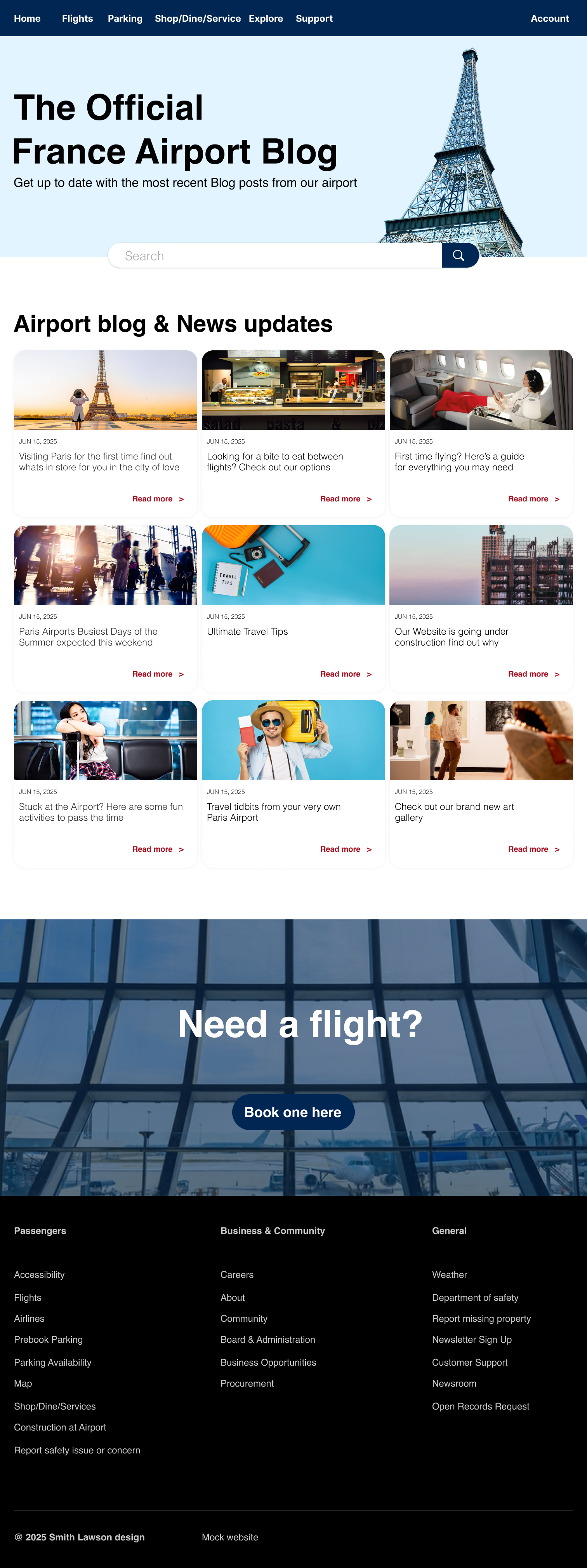
This is a blog I designed for an airport located in Paris. The layout is simple and straightforward, focusing on clarity and functionality. Below, you’ll find both the desktop and mobile versions, along with a few animations created for the site. The entire project was built using the Figma desktop app, with design inspiration drawn from other airport and travel blog websites.
From the people I’ve interviewed, a common complaint is that airport websites are often difficult to navigate. So for this blog site, my main goal was to create something clear, user-friendly, and easy to understand. To achieve this, I used soft colors and simple shapes to keep the layout clean and approachable. The primary color palette is inspired by the French flag—blue, white, and red—which subtly ties the design to its Parisian location.
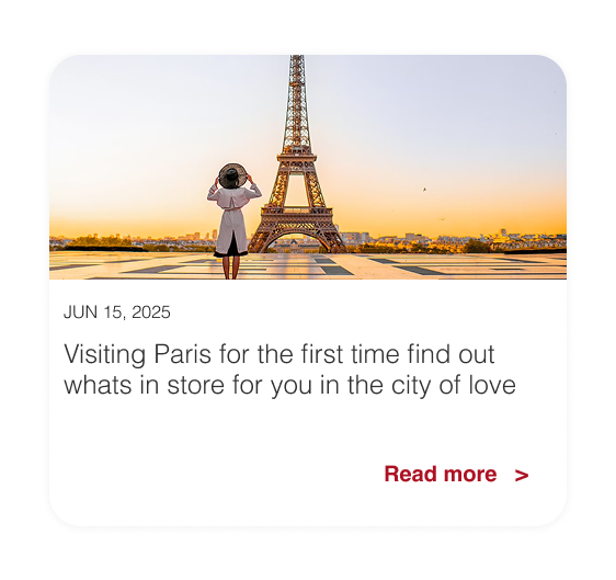
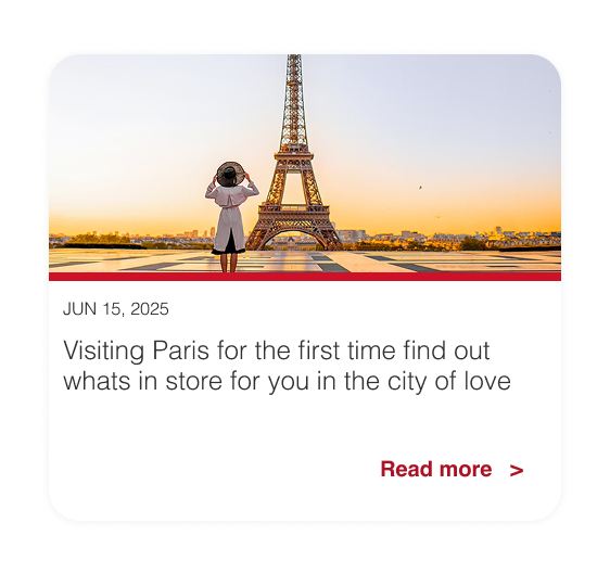
These blogs are mainly intended for travelers who are either about to fly or planning a trip to Paris. Some articles offer tips on what to do around the airport during layovers, while others provide basic updates and news related to the airport itself. Overall, the blog is designed to assist people who are new to flying or visiting Paris for the first time.
Here are some of the icons and segments I designed for the website

Below are the hover effects applied to the buttons above. The red line and bubble appear to indicate that the buttons are interactive, signaling to the user that they can click to navigate to the next page of the website.

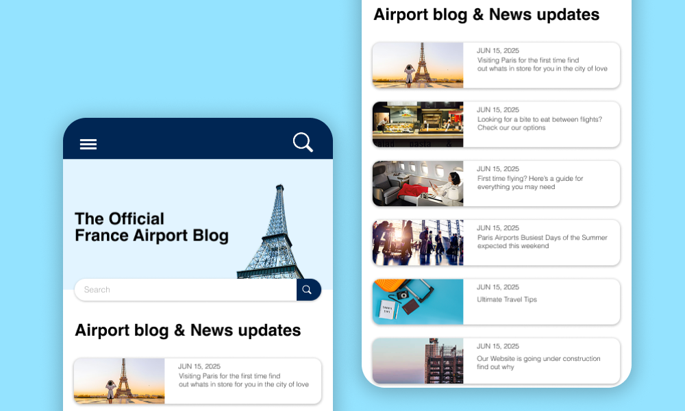
Below is the mobile version of the blog site. I chose to model it after a forum-style layout, where blog articles are displayed in a clean, top-down format for easier scrolling and readability on smaller screens.